Graphic design guidelines
Colour
Colour can be a powerful form of communication if used correctly. Acknowledging universal associations is a good place to start, such as, red is prominently used to portray danger and yellow to communicate warning. However, both of these colours can also be used as 'stand out' cues, such as a 'you are here' identifier on a wayfinding and map and information signs.
Colours used on signs must contrast with other elements. Use consistency across the family of signs. Light reflectance value (LRV) between graphic elements should also be considered for best visibility. See below for further guidance.
Council colour palette
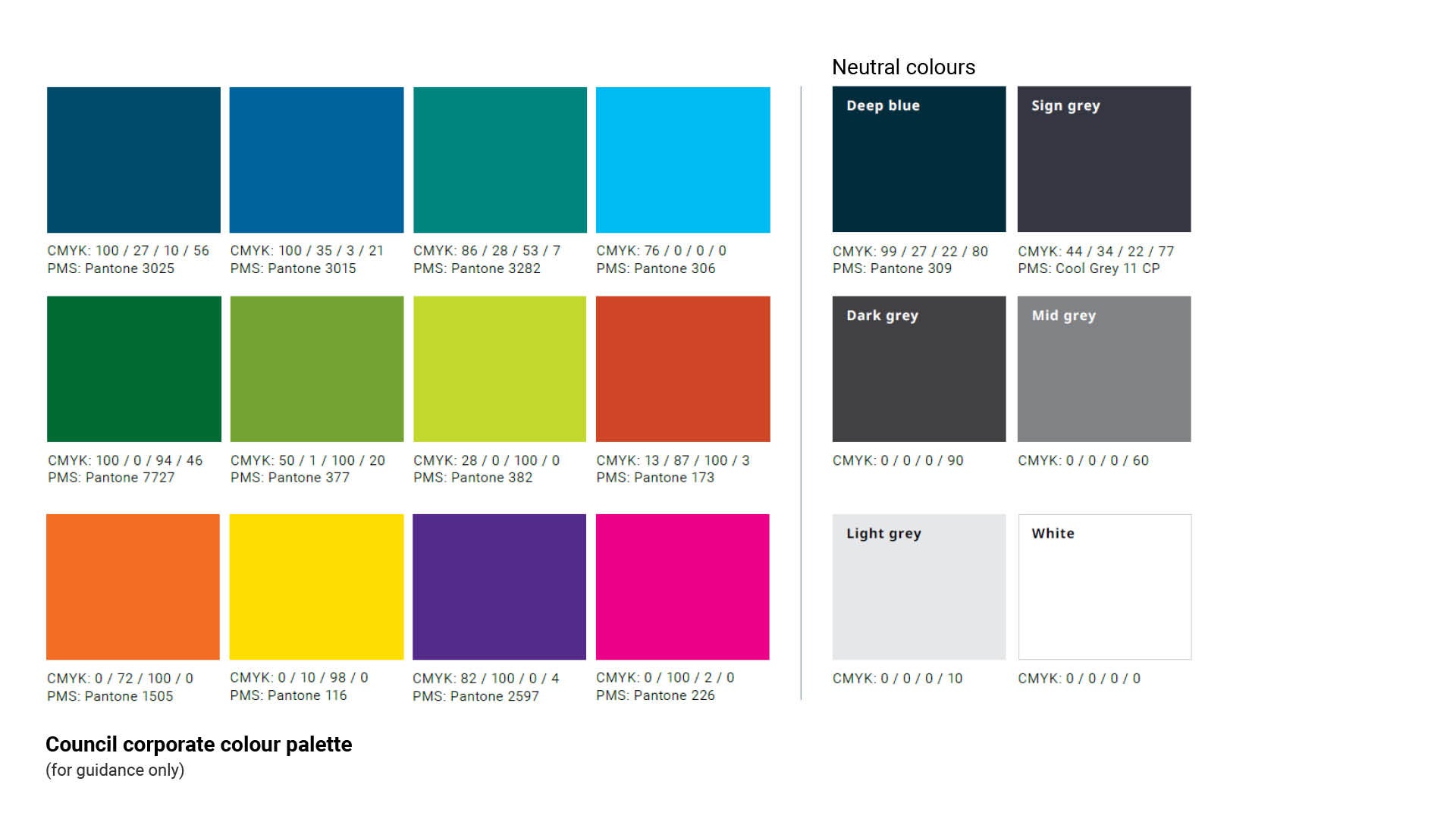
Colours used on signs are to be from the Council colour palette. See Figure 8: Council Colour palette. They have
been selected to ensure accessibility, clarity and consistency across Council signage.
The Council colour palette does not include the colour 'red'. The colour 'red' is only to be used when displaying regulatory information and or pictograms that are an Australian Standard or internationally recognised.
The Neutral colours in the palette play an important supporting role within the signage system. They help create a clear visual hierarchy and ensure key information remains easy to read.
Figure 8: Council Colour palette
Two additional brand colours
Two additional colours have been included in Council’s signage suite to maintain consistency across existing signage throughout the region Pantone Cool Grey 11 CP is Council’s primary neutral colour and must be used as the standard background colour for the majority of signage applications.
Pantone 377 has been added as an additional shade of green to reflect the original green used across Council signage in the region.
A broader selection of colours is provided to accommodate the full range of mapping colour codes. See LIM Signage - Graphic design guidelines - Maps for further guidance.
Figure 9: Additional colours
*ASH - WANT TO ADD PANTONE 377 AND COOL GREY HERE. PLUS WOULD YOU CONSIDER ALSO ADDING IN RED AND BLACK (USED FOR SOME REG SIGNS).
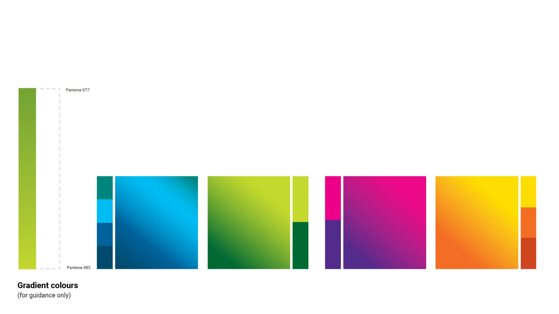
Gradients
Gradient can be used across our flexible design range of signage items.
Gradients add a dynamic and visually engaging dimension to communications. They are particularly effective in creating eye-catching backgrounds, adding a sense of movement, and enhancing the overall aesthetic appeal.
Be careful when using gradients to ensure that designs are legible and accessible – especially in the digital space.
Solid backgrounds can also be used in combination with a gradient brushstroke.
Note: A gradient background can only be used with the same gradient brushstroke.
Figure 10: Gradient colours
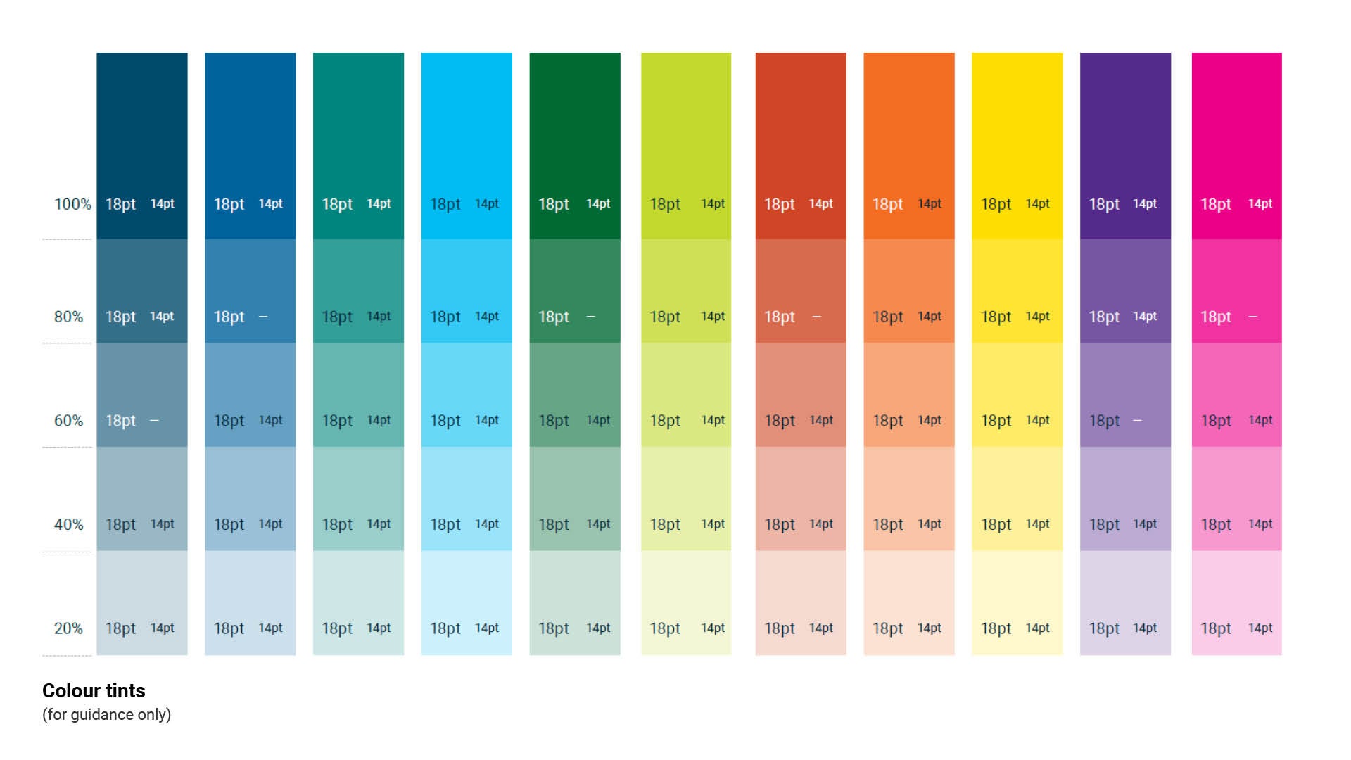
Using tints
When it comes to using our colour palette, we champion its full vibrancy and unaltered essence. However, we recognise that certain situations call for a touch of subtlety and versatility. That’s where our 20% tint step system comes into play - offering a seamless way to adapt while maintaining our brand’s visual impact.
Remember, the key to using these tints effectively lies in balance. We want to maintain the legibility of our text and the accessibility of our visuals. By thoughtfully applying these tints, we can create designs that are not only beautiful but also inclusive, ensuring that everyone can engage with our content effortlessly. So, embrace the palette in its full glory, and when needed, let the tints serve as your creative ally, adding depth and dimension
to our brand story.
When using text on tints, it must be accessible. The font size and text colour are accessible on some tints but not
others. You can see examples here of the font colours that are accessible in 18 pt and 14 pt for each tint.
Figure 11: Colour tints
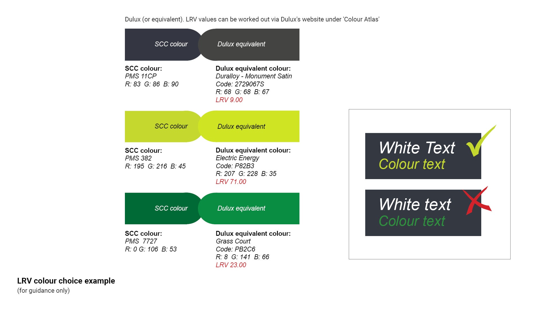
Light reflectance value (LRV)
The light reflectance value (LRV) of a colour indicates the amount of light and heat that the colour will reflect. The LRV is most commonly used when selecting colours for external and internal buildings. Examples: Black has an LRV of 0% and will absorb all light and heat. On the opposite spectrum; white has an LRV of 100% and will absorb no light and no heat.
LRV is also used to indicate the luminance contrast between individual colours when placed beside each other.
Figure 10 uses the example PMS 382 (characters) against the corporate background colour (PMS 11CP).
The two colours have LRV values that are far enough apart on the spectrum, creating sufficient luminance contrast. Text can be easily read.
The contra-indicated colour combination (the darker green) illustrates that both the LRV values are close to the lower end of the spectrum. They do not provide sufficient luminance contrast, and as a result difficult to read.
Figure 12: LRV colour choice example
This component is currently in development