Graphic design guidelines
Typography
Clear and consistent text presentation is essential for creating signage that is accessible, legible, and easy to understand. Together with appropriate text size based on recommended viewing distances, the use of ‘X’ height for accurate layout, and best‑practice approaches to letter spacing, capitalisation, and italics, ensure that signage remains readable for all users and aligns with recognised accessibility standards.
Size
The text size on all signs has been determined based on ideal viewing distances specified in Draft AS 1428.4.2:2017 Design for access and mobility Part 4.2 Wayfinding and must be followed wherever possible.
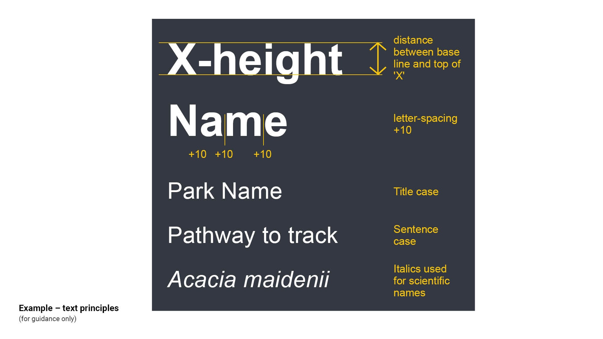
'X' height
For accuracy in layout of text on signs, the height of the capital letter ‘X’ should be used instead of the point size of the font. This measurement is always shown in millimetres unless otherwise stated.
Letter spacing
Letter spacing adds white space between letters to open up text. This increases the legibility and readability of each word. Added white-space around characters also allows individual characters to emerge and be recognised.
Title case
Title case uses capital letters for the beginning of each word. Title case must be used when identifying a place, organisation or a person's name (proper nouns).
Sentence case
Sentence case capitalises the first letter of the first word in a sentence. Sentence case should be used for body text.
Italics
Arial italics should only be used for scientific names, such as tree species. The first part of the name, the genus, should be capitalised, while the second part, the specific epithet, is not capitalised.
Uppercase
Uppercase is not acceptable. Uppercase words form uniform rectangular blocks with fewer distinctive shapes. Sentence case or mixed-case text creates more variation in letter shapes, increasing readability.
See Figure 3: Example – text principles.
Figure 3: Example – text principles
Approved fonts
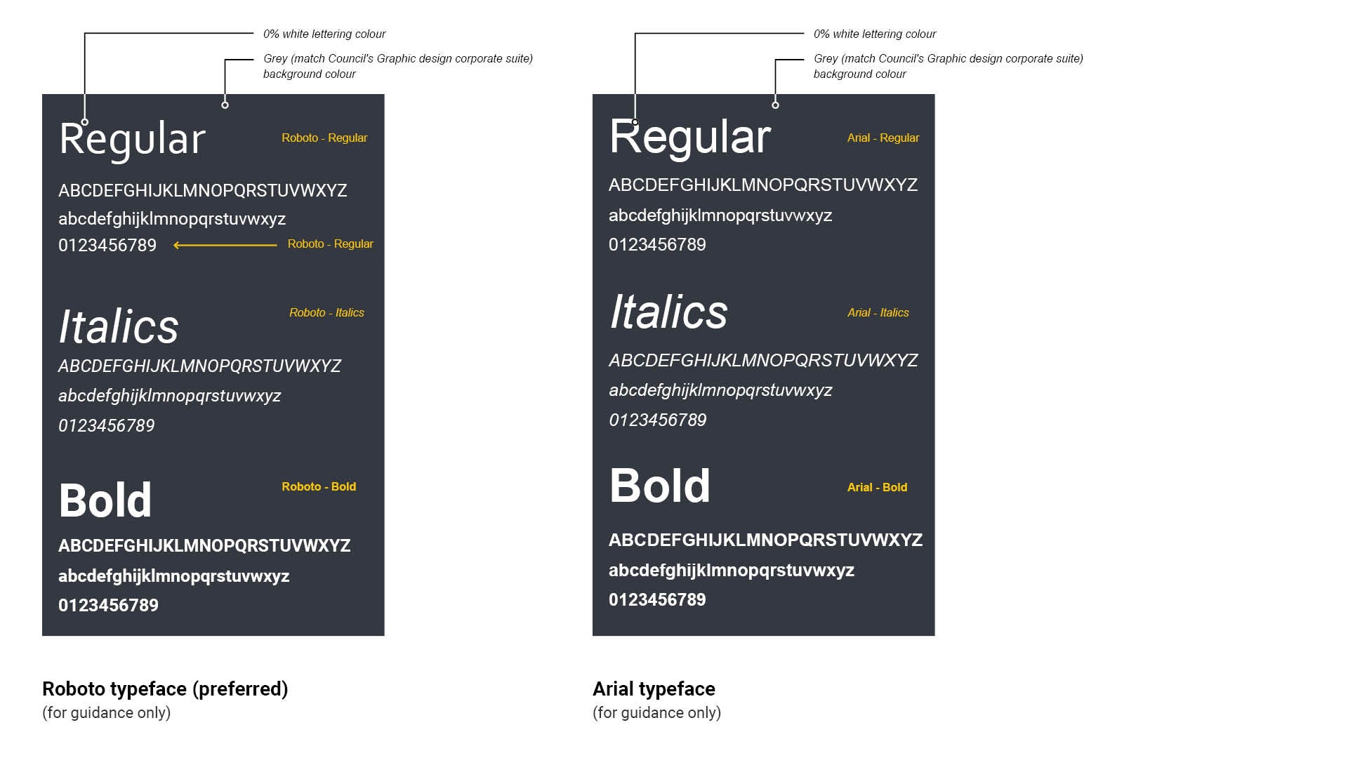
The corporate font 'Roboto' is the preferred font and must be used for all characters and numerals on all Council signs.
Australian standards specify sans-serif fonts must be used for all equal access signs. Sans-serif fonts are characters that are more clearly read by all users. The individual characters are simple in design without decorative strokes, allowing greater space between each letter. Roboto and Arial are sans serif fonts. See Figures 4 to 5.
For Council signs, the font colour on the adopted background (Pantone Cool Grey 11CP or CMYK 44/34/22/77) is white unless otherwise prescribed.
Default font style
- Roboto regular or Arial regular – body text
- Roboto or Arial italics italics – scientific names.
- Roboto Bold or Arial Bold – headings.
For font size, consider the environment in which the sign is displayed and proximity of the reader to the sign. See LIM Signage - Positioning for further guidance.
Figure 4: San-serif/Serif typeface examples
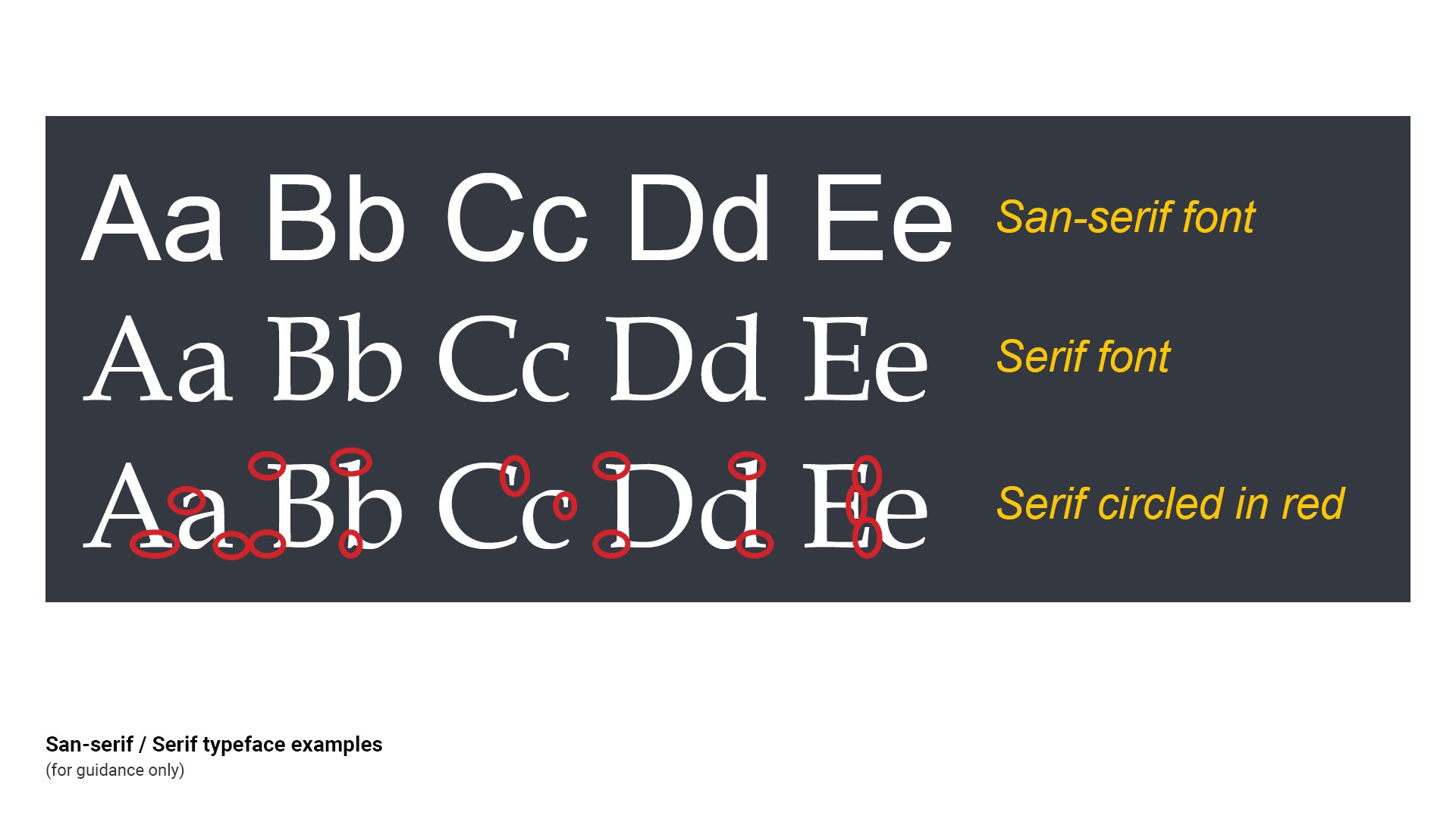
Figure 5: Typeface types (Roboto (preferred) and Arial character and numbers)
This component is currently in development