Graphic design guidelines
Maps
General overview
Maps are useful tools to showcase areas and features.
The focus of any map is to display the geographic area and key points of interest that may be accessed by the reader. Maps displayed on signs are designed to be viewed at a pedestrian level because the map content can be detailed.
Usually the first element a viewer will seek, is the 'you are here', identifier. This symbol will help the viewer locate approximately where they are positioned in relation to the map displayed.
A map sign should show major destinations and the locations that may be found along the path, track or trail. Major landmarks will aid the reader to orient themselves.
Many people have difficulty interpreting a two-dimensional map or plan view. To assist the reader to interpret the map, consider the following:
- The map layout should be in the same orientation as the environment. If the map is not North facing, ensure a north point symbol is included on the sign for accurate orientation.
- Provide a 'you are here' symbol to help the reader orient themselves.
- Provide a legend, scale or grid and north point symbol.
- Provide a legend/key which helps to keep the map simple.
- The map may include key landmarks and contour lines. These features will aid in the navigation of the map
- The map may include contour lines where the site has varying topography. These lines provide additional information about potential difficulty. Closely spaced contour lines indicate a steep slope and a more challenging walk, while widely spaced lines represent a gentler, flatter grade.
- Only include relevant information.
- Use visual aids such as photographs/artistic illustrations to accompany the map.
- Ensure the sign is clear and easy to read. Use council approved fonts, as well as appropriate size font for application.
- Use contrasting colours for clear interpretation and legibility sign. Calculate the light reflectance value (LRV) to verify luminance contrast between individual colours if unsure of the contrast.
- Use visual aids such as contour lines, which immediately show an indication of the grade of the trail network together, providing key landmarks.
- Use Council approved fonts for all maps. All text must be in sentence case. Writing entire words in capital letters is not accepted, as this format reduces accessibility and can be harder to read. Text colours should be as indicated below in Map colour palette and use.
Scale of the map
Where possible, the map should be scaled to the approximate width of the sign panel or to suit the requirements of the sign. Each site will be different and therefore scales will differ. Where possible the map should be laid out in the same orientation as the environment to be explored.
Displaying distances (m vs km)
- When displaying distances the map must contain distance in metres or kilometres (site specific).
- Less than 1.0 km must be displayed in metres to the nearest 50 m.
- Greater than 1.0 km must be displayed in kilometres rounded to the nearest 0.1 km.
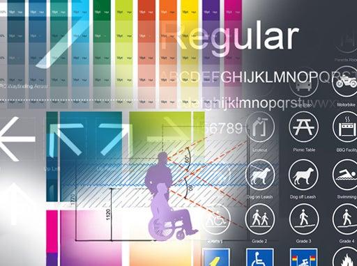
Map colour palette and application
It is vital that colour combinations are legible. When selecting colours, each colour must have luminance contrast against the background colour. The following key points must be considered:
- Red and green are colours that are difficult to distinguish by people with colour blindness (1 in 10 men, 1 in 72 women). These colours are similar in tonal value, so a highlight colour such as yellow or white should be used to separate them.
- Colours of similar tone must not be used beside one another, as they will merge together and be difficult to distinguish for all viewers.
- Where possible, choose colours that have universal meaning such as blue for water, green for parks. This will improve the readability of the map.
- When an area contains several paths/tracks/trails that are required to be shown on a single map, it can be to difficult to select colours. Make sure the colours are distinct from one another. If an orange and a red are selected, make sure they have different tonal values (the relative lightness or darkness of a colour), so they do not become confused.
See the following:
- Figure 11: Map colour palette
- Figure 12: Map colour palette application examples.
Figure 11: Map colour palette
*ASH TO ADVICE HERE
Figure 12: Map colour palette application examples
*ASH TO ADVICE HERE
Map colour blindness testing
*ASH TO PROVIDE CONTENT
This component is currently in development