Overarching guidelines

Equal access
Requirements for the integration of equal access for all users
The Disability Discrimination Act (DDA) defines ‘premises’ as the whole of the built environment and includes existing buildings, new or proposed buildings, transport systems, car parks, pathways, and public parks and gardens.
Note: Consult an access consultant accredited by the Association of Consultants in Access Australia (ACAA).
Elements required for equal access
The following elements should be considered in regards to equal access:
- Signage must comply with AS 1428.4.2:2018 Design for access and mobility, Part 2.4 Wayfinding signs.
- Consider a range of abilities when installing a sign.
- For people with low vision and people who are blind, the sign must be presented in a format which is accessible such as:
- Unified English Braille Cide (UEBC) Grade 1.
- Raised tactile text.
- Raised tactile pictograms.
- To be accessible to a person who navigates by white cane, a sign must be:
- Along a continuous accessible path of travel.
- To alert the person to the location of a sign, a cue is required, such as a textured treatment full width across the path of travel.
- Good sight lines and clear visuals on signs, will assist the movement of people who have low vision and people who are deaf, as they rely heavily on visual information to safely negotiate the environment.
- White text on a black or similar background reduces glare and creates contrast.
- Avoid finished height difference between a concrete slab and adjoining surfaces to prevent trip hazards and to prevent ‘tramlining’ of pram, bicycle and wheelchair wheels.
For further guidance, see: Wayfinding markers.
Low vision and blind people
The majority of people who are vision impaired have some vision. Sufficient luminance contrast in sign design, enhances access for everyone.
Consider people who have a degree of vision loss including ‘partially sighted’, ‘legally blind’ or ‘totally blind’ people:
- Partially sighted – includes people who have some vision loss.
- Legally blind – someone who has less than 20/200 (imperial) or 6/60 (metric) vision.
- Blind – a person who lacks a sense of sight.
Luminance contrast is vital for people with low vision to identify and locate a sign. They are then able to locate and read the Braille and/or raised tactile elements.
- Install raised tactile and Braille signs at a height between 1.2 m and 1.7 m to the top of the sign. Content is to be between 1.2 m and 1.6 m with the message to be from the top down. The content can be accessed by a person who is seated or standing.
- Install signs with clear visual displays.
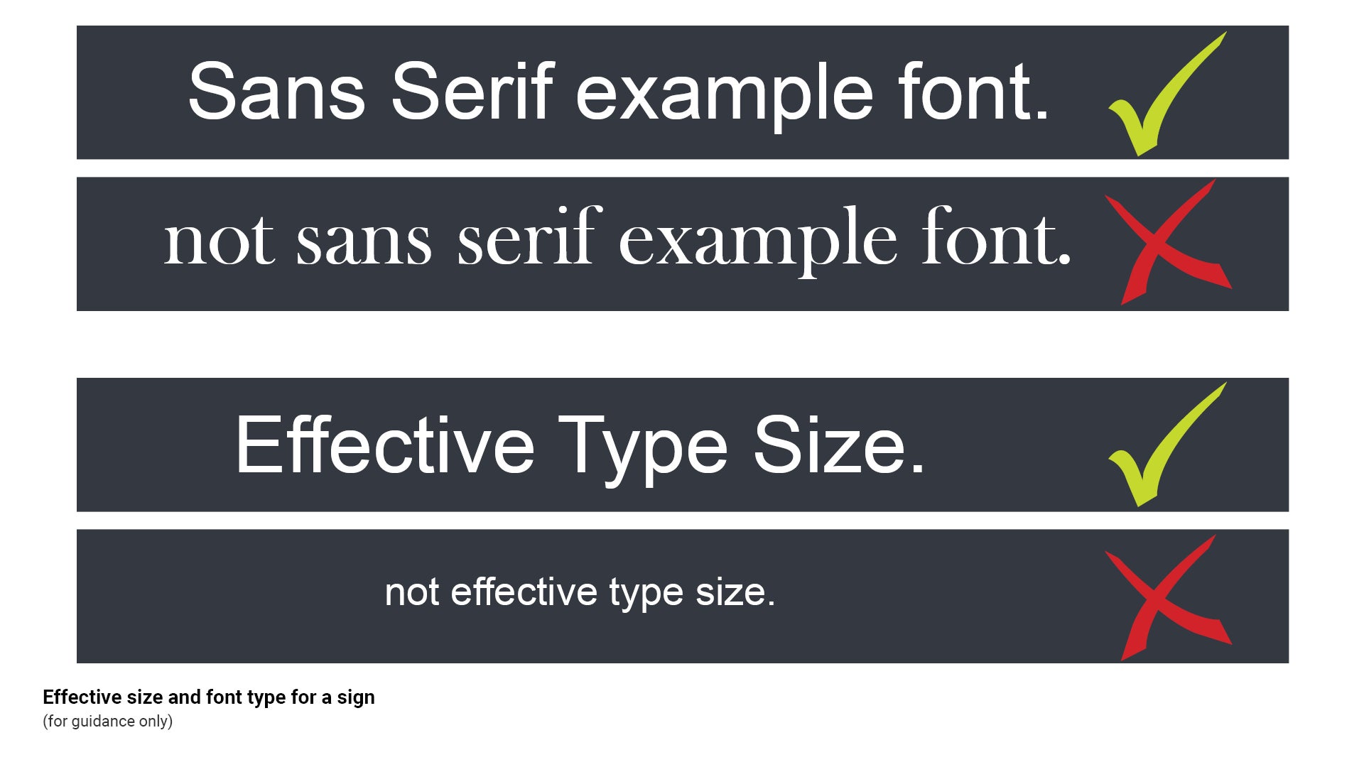
- Use title case because it is easier to comprehend the meaning and intent of the sign, especially for people with various levels of cognitive or intellectual impairment.
- From an early age our brains recognise the shape of a written word almost as much as the letters within.
- Typically, when upper case only, is used, the shape of the word is lost and from a distance the word becomes more difficult to decipher.
- Using title case allows quicker recognition of a word from a distance.
- Use Sans serif fonts such as Arial as it is one of the clearest and easiest fonts to read. The constant thickness of the letters and lack of serifs (a small line attached to the end of a stroke in a letter), make signs readable and legible, less cluttered and does not distort the shape of the letters.
- Correct terminology – use the word 'accessible' for signage (where possible) as 'disabled' marginalises the intended user group.
See Figure 19: Effective size and font type for a sign.
Figure 19: Effective size and font type for a sign
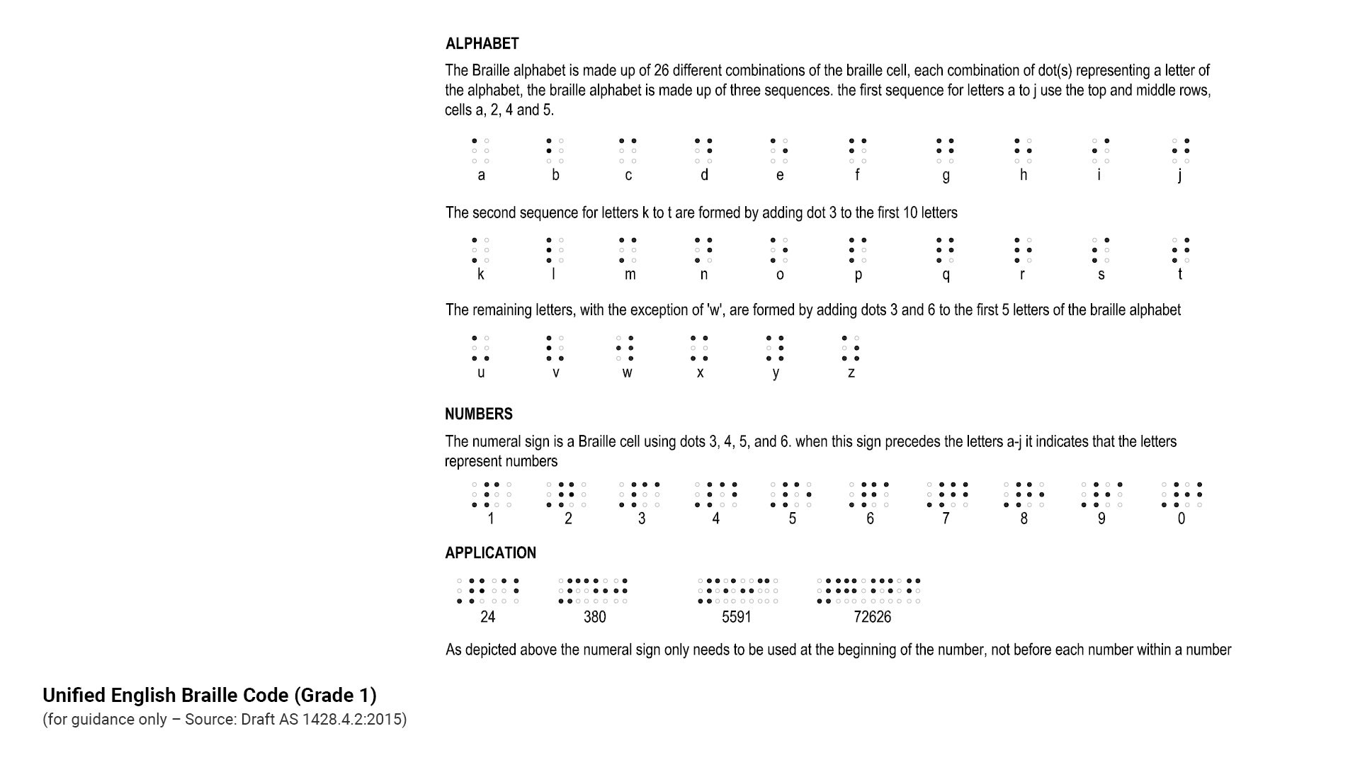
Raised tactile and Unified English Braille Code (UEBC) Grade 1
- Raised tactile and UEBC signs allow people who are blind or have low vision to read and interpret information using the tips of their fingers.
- Braille is to be Unified English Braille Code (UEBC) Grade 1. Ideally Braille should not have luminance contrast with the background it is viewed against.
- Not all vision impaired people can read Braille. Install raised tactile and UEBC signs.
- For people with low vision who have some usable vision, luminance contrast is an important aid to enable them to:
- Identify the location of a sign.
- Read a Braille and or raised tactile sign.
- Where signs are installed in a raised tactile and Braille format, the message should be equivalent to that being described in text or pictograms.
- For reach heights and raised tactile and Braille signs refer to AS 1428.4.2:2018 Design for access and mobility, Part 4.2 Wayfinding signs.
- Braille height must be 6.0 mm, as this allows the user's finger to run continuously over the message.
- When using raised lettering, upper case tactile letters should have a minimum height of 15 mm and a maximum height of 55 mm.
- When used on map signs, upper case tactile lettering should be a minimum 12 mm high.
See the following:
- Figure 20: Raised tactile and Braille sign example
- Figure 21: Unified English Braille Code (Grade 1).
Figure 20: Raised tactile and Braille sign example
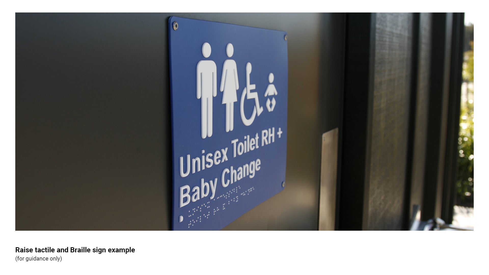
Figure 21: Unified English Braille Code (Grade 1)
Colour and texture requirements
Sign colours
General
- Provide sufficient luminance contrast with the background against which a sign is viewed. Ensure the luminance factor is not less than 30%, for ease of identification by people with low vision.
- Where luminance contrast cannot be achieved (such as grey aluminium furniture on grey concrete), luminance contrast can be improved by providing a coloured base slab which has a minimum 30% luminance contrast with the embellishment base, resulting in the embellishment being more visible for people who have low vision and people who are blind.
- Two colours that contrast sharply to someone with normal vision, may be far less distinguishable to someone with a vision disorder.
Colours for partial sight and colour deficiency
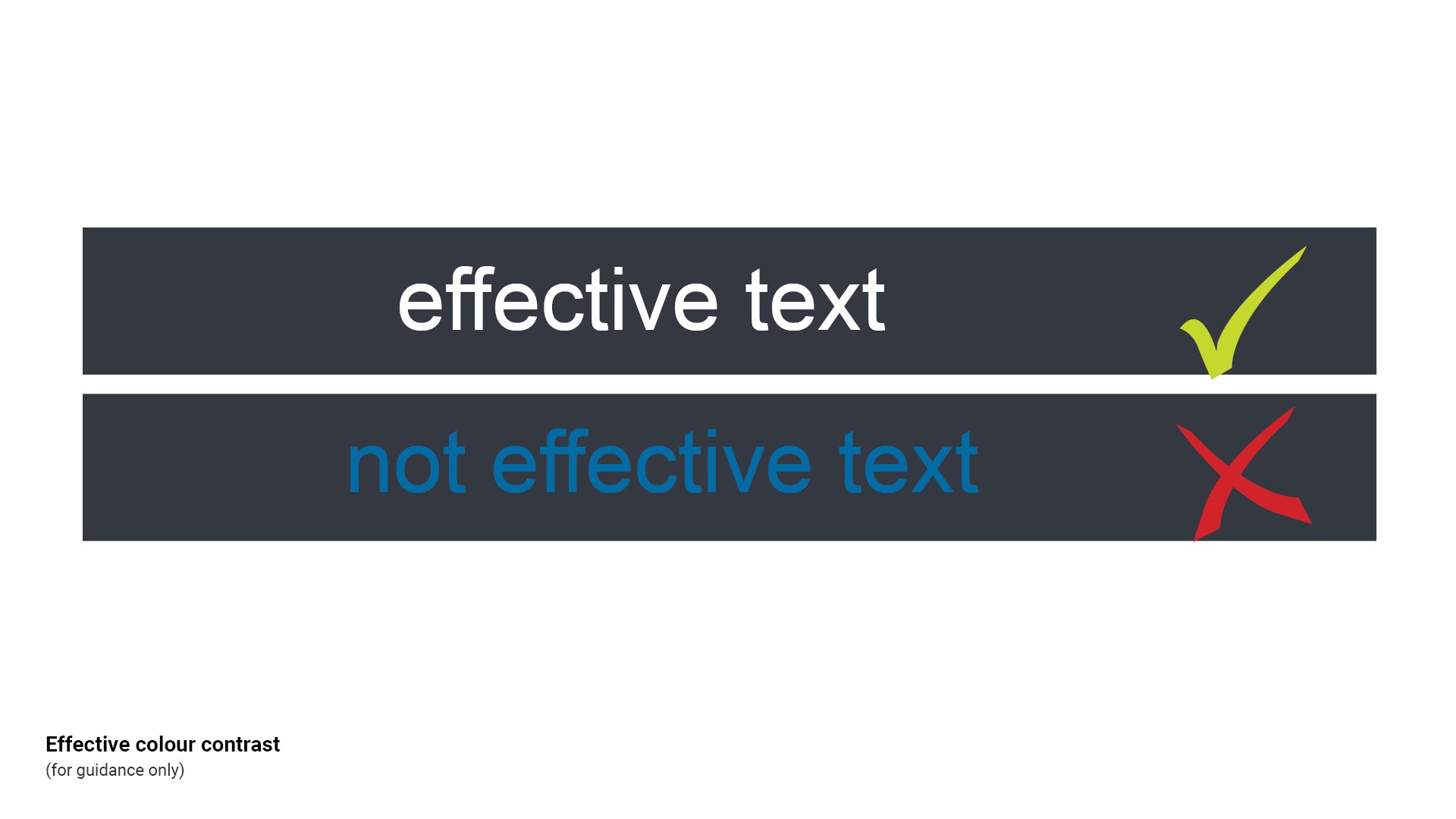
- To make effective sign colour choices that work for almost everyone, consider the three perceptual attributes of colour – hue, lightness and saturation (as they are used by vision scientists):
- Hue of a colour is defined as the degree to which a stimulus can be described as similar to or different from stimuli that are described as red, green, blue and yellow.
- Lightness (also known as value or tone) is a representation of variation in the perception of a colour or colour space's brightness.
- Saturation is the intensity of a colour, expressed as the degree to which it differs from white.
- The following measures can be incorporated into signage design to enhance the usability by people with low vision:
- Exaggerate lightness difference between foreground and background colours. Text should be printed with the highest possible contrast.
- Avoid using colours of similar lightness adjacent to one another, even if they are different in saturation and hue.
- Choose dark colours and hues, against light colours and hues.
- Colour deficiencies associated with partial sight and congenital deficiencies make it difficult to discriminate between colours of similar hue.
See the following:
- Figure 22: Effective colour contrast *ASH WE MIGHT DELETE THIS FIGURE TBD
- LIM Signage - Graphic design guidelines - Colour for further guidance.
Figure 22: Effective colour contrast *ASH WE MIGHT DELETE THIS FIGURE TBD
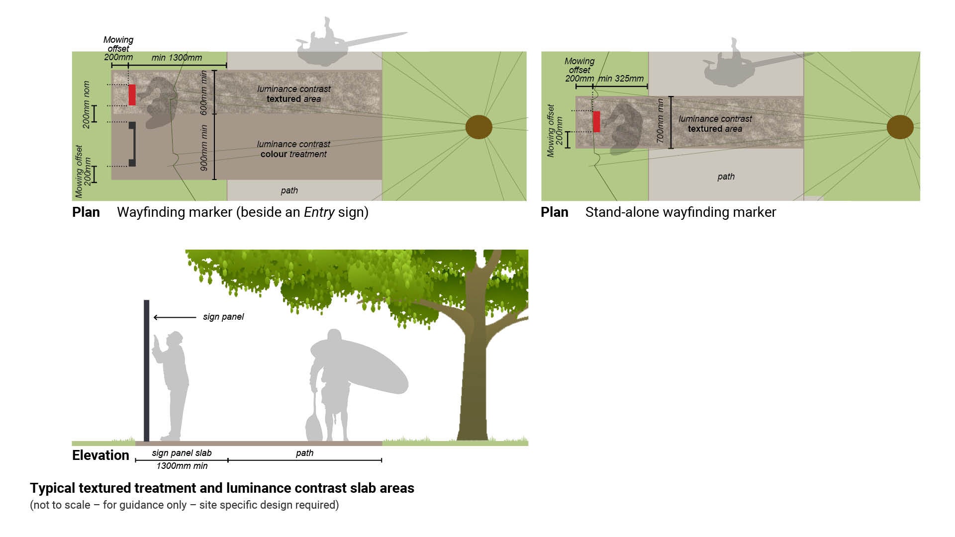
Pathway treatment
- For new pathways, consider a contrasting colour as well as a textured surface treatment across the full width of a path of travel. This will alert people with low vision and people who are blind to the location of a sign. This treatment is to form the sign slab.
- The aim is for people with low vision to become accustomed to the cue for a sign location. This will aid in navigation of other parks and reserves that apply the same standard.
- For existing pathways, add a hardstand area with a coloured, textured treatment – minimum 600 mm wide. A luminance contrast treatment area, may be a material with a different texture to the pathway, (such as exposed aggregate).
- A stand-alone marker requires a textured/coloured slab to be a minimum 700 mm wide. This allows a 200 mm mowing offset either side of the 300 mm wide Wayfinding marker - equal access.
- A wayfinding marker (beside an Entry sign) requires a textured/coloured slab to be a minimum 600 mm wide.
See Figure 23: Typical textured treatment and luminance contrast slab areas.
Figure 23: Typical textured treatment and luminance contrast slab areas
This component is currently in development